|
REVIEWS
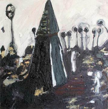
Human Detritus, Readymade, 2017 Oil, egg/oil/wax emulsion on wood panel, 24 x 24" This new series of images, Human Detritus, is satisfying in their painterly and visceral abstraction. The hooded forms in #2 and # 3 are enigmatic; suggestive of both a tree and human figure. The thinner tendril-like shapes in the background of the muted, almost achromatic piece (#2) serve as secondary figures- eyes watching the central subject. I also enjoy the impasto surface of the work. The textural black sections offer dark passages of interest, and slighter quieter space than the active brushstrokes with color and value contrast. While death of organic matter is implied in both the painting’s palette and title, there is also a beauty in the stillness and dark heap of the structures. The pinker version with a similar configuration (#3) is arguably more uplifting. I wonder if these new works were inspired by Rasmenia Massoud’s collection of short stories by the same title. They appear to tap into similar caustic observations of the human spirit, but break the archetypes down into even more primeval and intuitive shapes. Kristen T. Woodward, Curator Professor of Art at Albright College, Reading, PA Temple to Human Nature and When Petroleum was Sexy
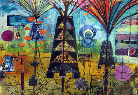
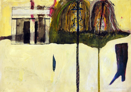
Mixed-media on paper, Acrylic, charcoal, graphite, and ink on paper. 25 x 19” 2015 2015 Truth To Power Show #3, Pleiades Gallery, Durham, NC, July 30 – August 30, 2015 Eric Hunter is represented by two pieces – Temple to Human Nature and When Petroleum was Sexy. Both are wonderful mixed-media works on paper. Temple is a "comment on the one true American religion that is capitalism, and the petroleum industry…lust and avarice…no matter the cost." I was taken by the crude temple to Athena and the inked oil rigs gushing rainbow flames, but especially by the tall ladies boot – fashionable profit, pretty disaster, a date with doom. When Petroleum is a colorful map of "nostalgic magic that was, and too many still is, Petroleum, gasoline, oil." I am sucked into a landscape as beautiful and apocalyptic as a Henry Darger drawing, an obsessive memory map by a survivor of our post-industrial-all-digital-and-obsolete world. Geysers of rainbows; polka dotted skies; networked land; Carolina blue….none of it will save us. We must save ourselves. Elin O'Hara Slavick Professor of Art, UNC Chapel Hill, NC |
|
|
Outgrown Ketchup
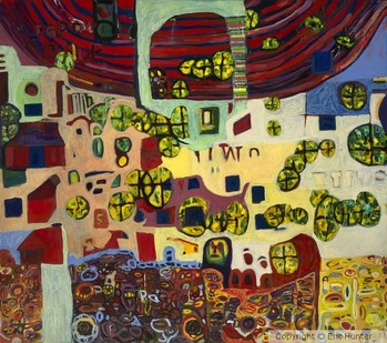
Oil/alkyd/emulsion on canvas. 84 x 73" The title Outgrown Ketchup makes me imagine I’ve missed some kind of story, or inside joke. And there is a subtle humor in this work, much in style of Post War Guston or Dubuffet. The busy, tiny pieces suggest people in houses…trees and architecture….animals and wheels. I detect but can’t quite pinpoint other influences. The flattening of the space is someone reminiscent of folk art; however I do see a more formal, trained methodology to the colors and composition. Shippin Container Livin or Sonoma County Landscape look more comfortably rooted in the outsider tradition, in their rejection of linear or atmospheric perspective. But I favor Ketchup because it has the vivacious animation of the other works, but a more beautiful handling of deep reds and creamy whites. The dark red half circle/crescent on top mirrors the contrasted slice of activity on the bottom, allowing me guided visual passage through the interior gap. It is a highly enjoyable, humanistic piece.
Kristen Woodward, Curator Professor of Art at Albright College, Reading, PA Artist2Artist Review, July 2011 |
Outgrown Ketchup
|
|
Personal Network
Oil, alkyd and emulsion, 10 x 12". I appreciate the slightly quirky idiosyncratic, animated quality of these forms. The asymmetrical arrangement employs an unusual figure-ground dynamic, with a vague reference to more traditional table/tableau and still life. I was surprised to be reminded of your more embellished paintings when I looked at this piece in the context of your portfolio- Chloroplasts, while posted along with these recent paintings, shares the frenzied energy and allover pattern of the other pieces from three years ago. By comparison this new work seems rather minimal. But the dark violet and bright yellow-orange hues have a bold split-complementary relationship and offer pleasing narrative contrast to the otherwise non-objective images. I interpret a cautious tension in the white positive forms, as if they are voided out silhouettes of former full-hued objects. Organic in nature, there is still an underlying architecture to the organization of space. I’m also interested in the relationship between the warm reddish background color and the inserted shapes of the same color inside the white forms. Again injecting anthropomorphic attributes into the abstraction, the white shapes could be consuming their more vibrant exterior. Kristen Woodward, Curator Professor of Art at Albright College, Reading, PA Artist2Artist Review, July 2011 |
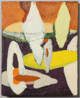
Personal Network
|
